Two sites, walked through end to end.
Screenshots show what a site looks like. These two show the thinking behind it — the problem, the decisions we made, and what changed. Drag the sliders to compare.
Comstock Tire and Auto
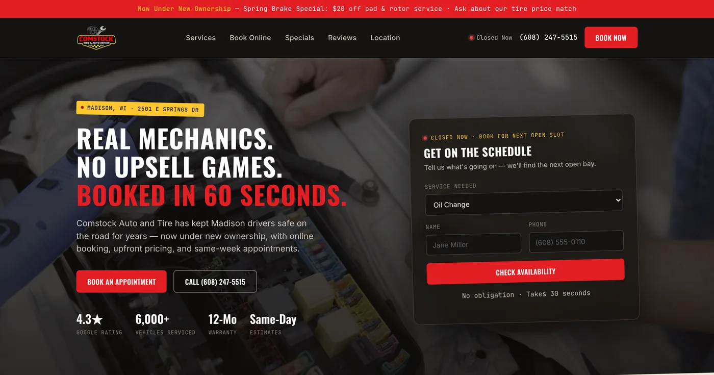
A tire and auto repair shop that needed to take bookings off an already-ringing phone.
The problem
Comstock's day-to-day is loud — techs mid-repair, phones ringing, a front counter that never stops. Every walk-in and call-in pulls someone off the floor. The shop needed a site that could take booking off the phone entirely, and show up clearly for people searching "tire shop near me" on a cracked phone screen in a parking lot.
The design decisions
Booking front and center — the scheduler sits above the fold on every page, not three clicks deep in a "Contact" menu. A service menu that reads like a menu — tire, brake, oil, alignment, and diagnostic work broken into a scannable list instead of a wall of paragraph text. Built for the parking-lot search — directions, hours, and phone number are visible without scrolling on mobile, since most traffic starts as a location search, not a homepage visit.
The result
A site that does the job the front counter used to do alone: answer "can you fit me in" before the phone even rings.
DS3 Solutions
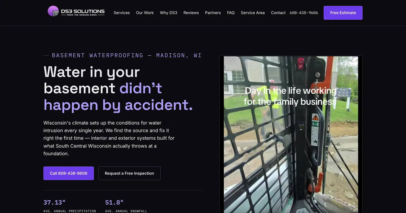
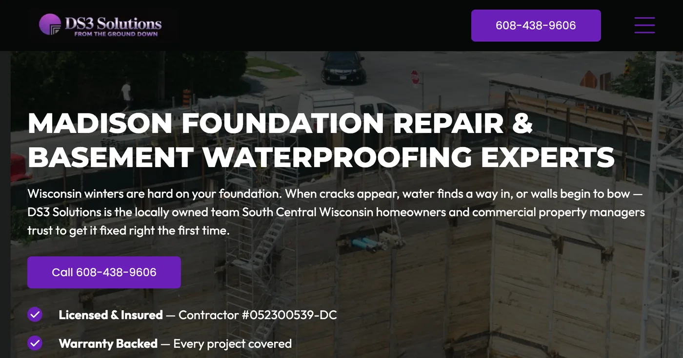
A professional-services brand that needed visitors to understand what it does in the first five seconds, not the first five paragraphs.
The problem
DS3 does technical, high-trust work — but a site that buries what a company actually does loses visitors who arrived ready to buy. Before the rebuild, the value proposition was competing with a company history nobody had asked for yet, and it wasn't obvious what a visitor should do next.
The design decisions
Lead with the offer, not the origin story — the homepage opens with what DS3 does and who it's for. One clear conversion path — every section funnels toward a single, obvious next step instead of splitting attention across competing calls to action. Credibility signals up front — the trust markers that make a B2B visitor comfortable reaching out sit near the top of the page, not the bottom.
The result
A site whose only job is getting the right visitor to reach out — not to look impressive and hope they figure out how.
Client websites
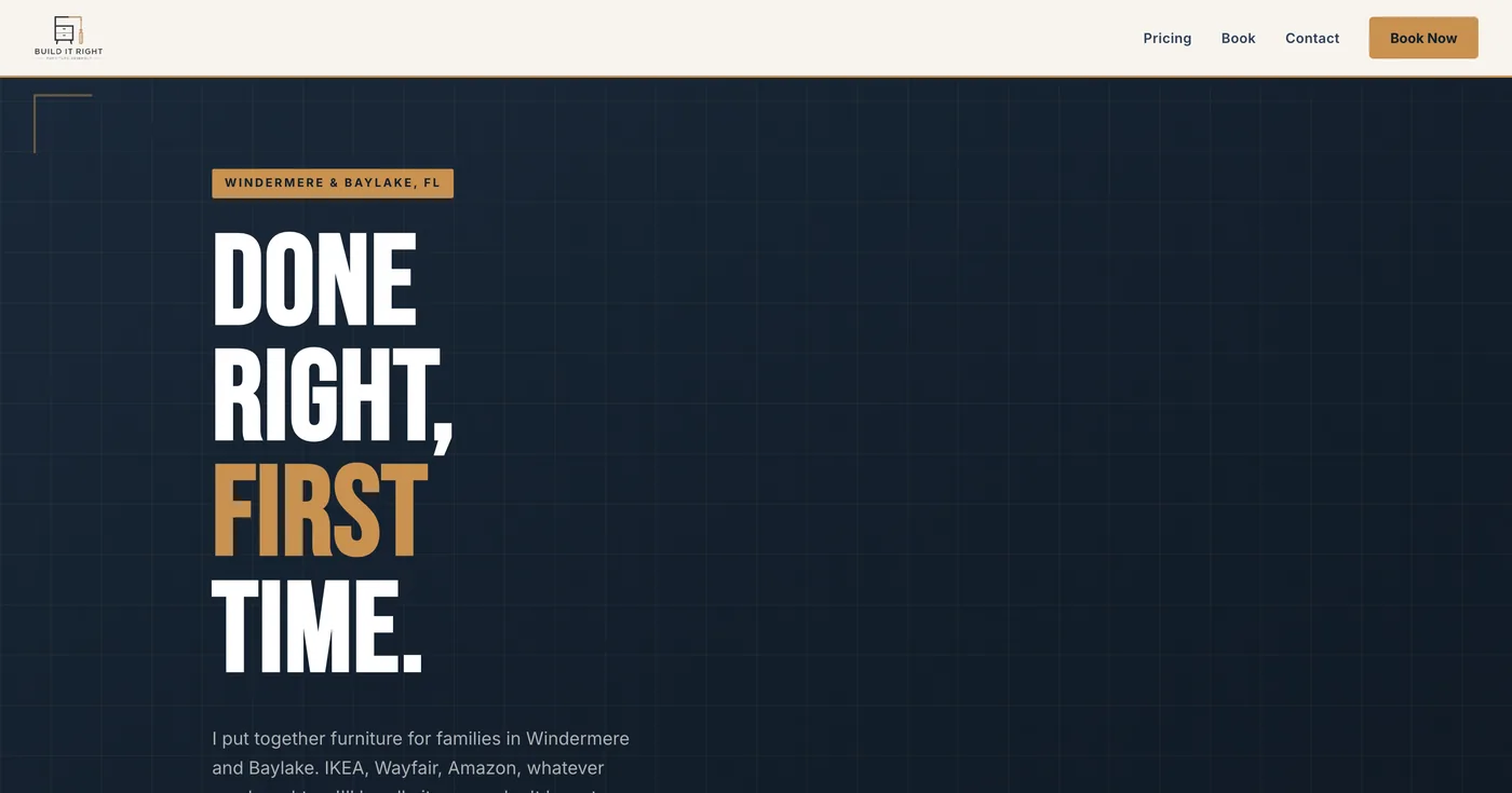
Build It Right
A rebuilt marketing site for a residential and commercial contractor, with a clear services breakdown, project gallery, and an online estimate request form.
Comstock Tire and Auto
A local tire and auto repair shop site with online appointment scheduling, a service menu, and directions built for customers searching nearby.
DS3 Solutions
A professional services site focused on clearly explaining what DS3 Solutions does and turning visitors into qualified leads.
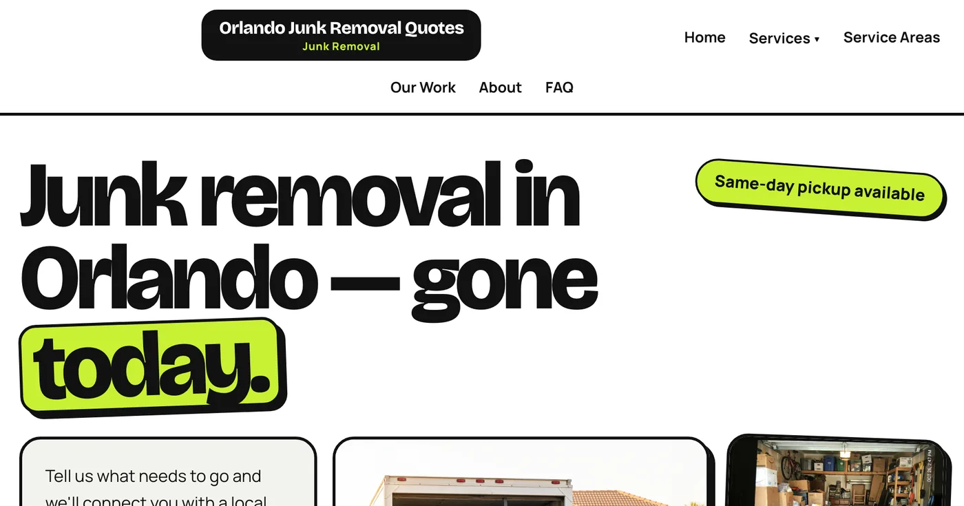
Junk Removal Quotes Orlando
A same-day junk removal quote site for the Windermere, FL area, built around a fast quote form that turns searches into booked jobs.
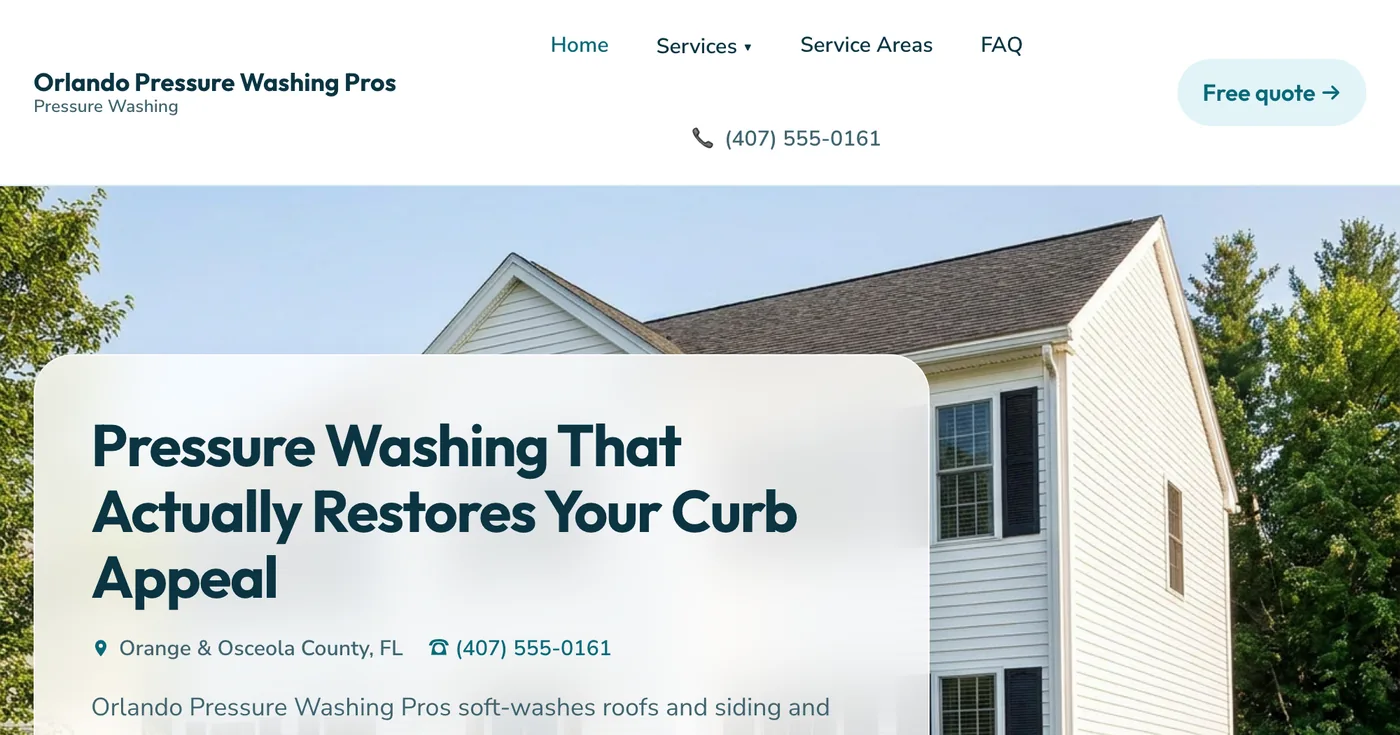
Orlando Pressure Washing Pros
A lead-generation site for pressure washing services across Central Florida, built around a fast, no-friction free-quote form.
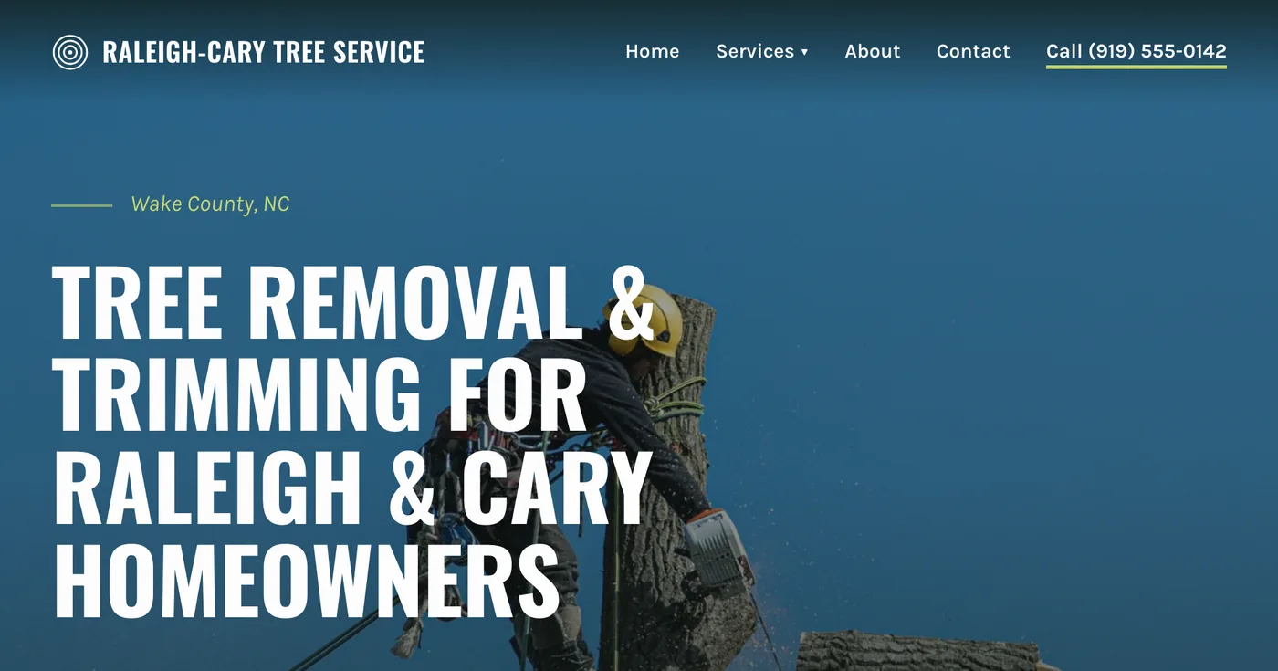
Raleigh-Cary Tree Service
A multi-page site for a Raleigh-Cary, NC tree removal and trimming company, covering service areas from Apex to Wake Forest.
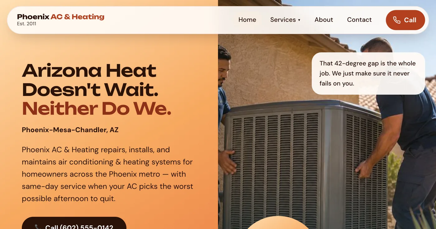
Phoenix AC & Heating
An AC and heating repair site for a licensed Phoenix, AZ contractor, built to convert emergency repair searches into calls.
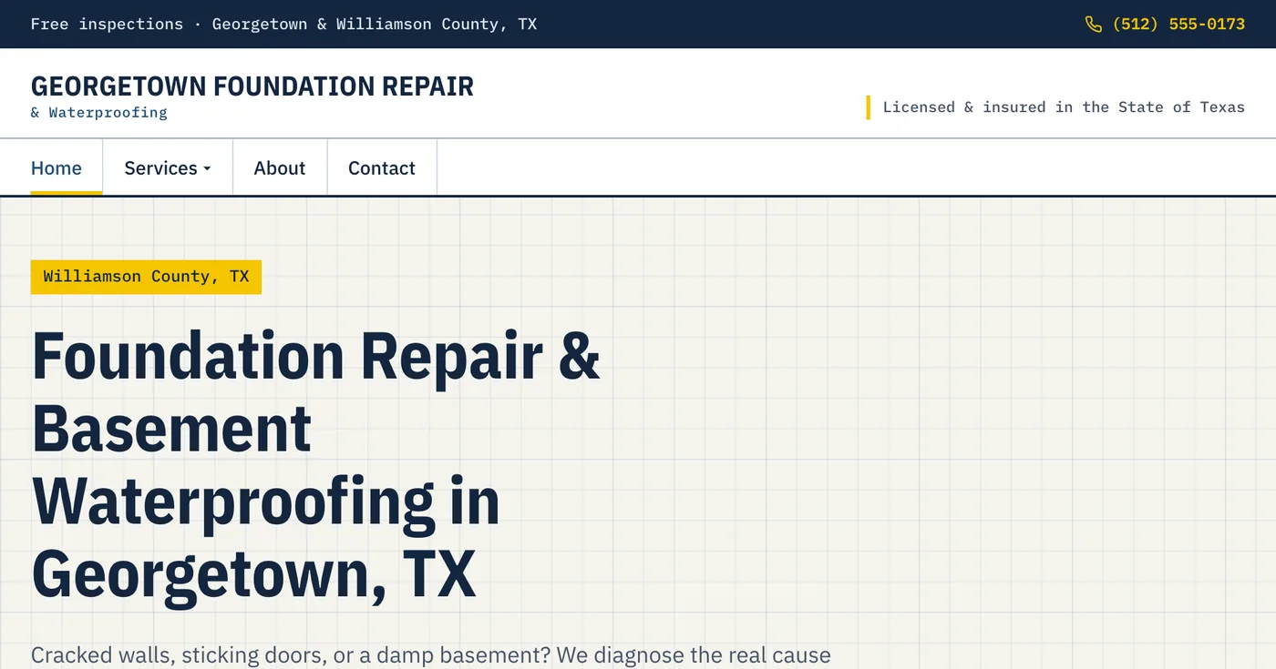
Georgetown Foundation Repair & Waterproofing
A foundation repair and basement waterproofing site for a Georgetown, TX contractor, with service-specific pricing pages and a free-inspection request form.
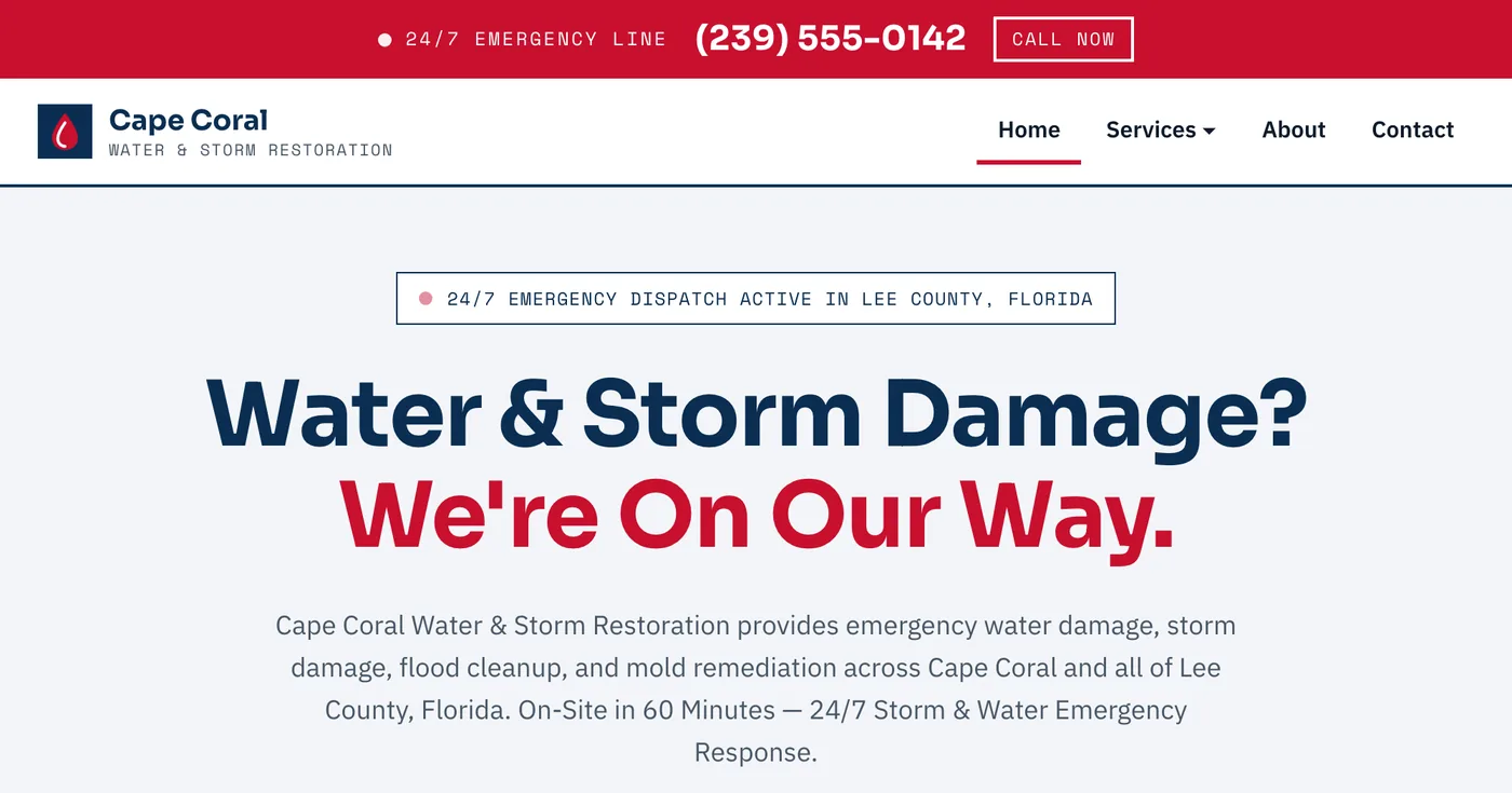
Cape Coral Water & Storm Restoration
A 24/7 emergency water, storm, and flood damage restoration site for a Cape Coral, FL company, built around getting an on-site crew dispatched fast.
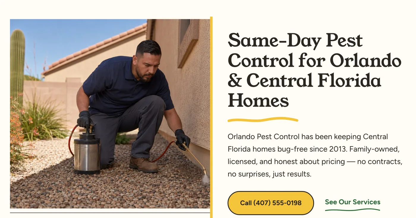
Orlando Pest Control
A pest control site for Orlando and Central Florida, with dedicated pricing pages for general pest, termite, mosquito, rodent, and bed bug treatments.
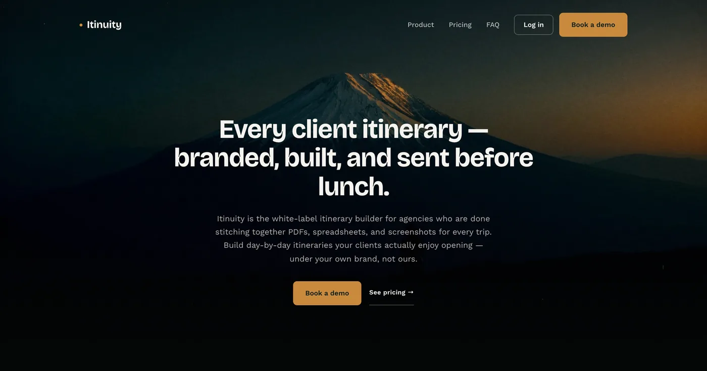
Itinuity
A white-label itinerary-builder landing page for travel agencies, with a full pricing breakdown and feature walkthrough built to convert visitors into booked demos.
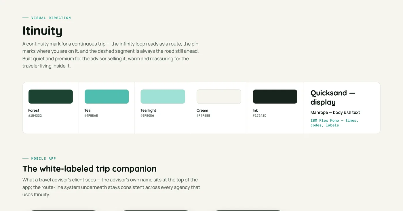
Itinuity — Visual Direction
A brand and UI direction concept for Itinuity's mobile app and marketing site — color system, typography, and mobile screens used to pitch the product's design language.
Like what you see?
Let's talk about what a Morrowframe site could do for your business.
Start a project